Publié dans : Pédagogie
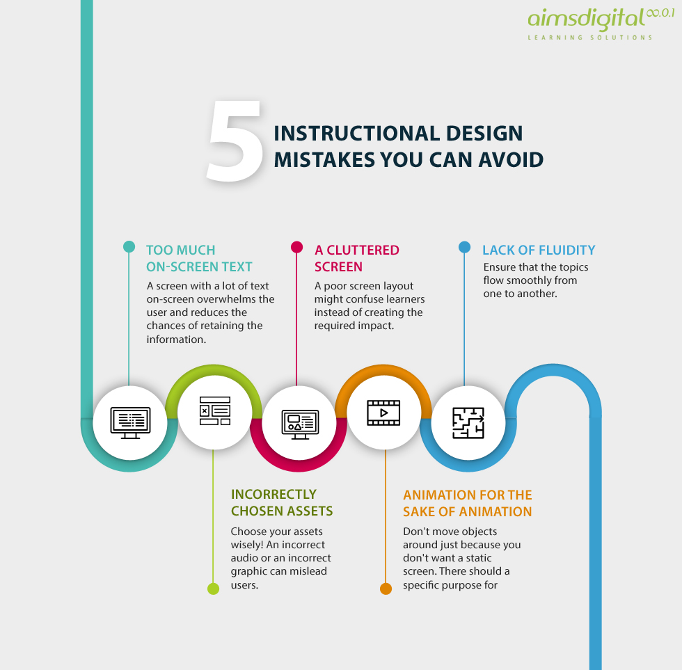
Everyone makes mistakes. Yes, even Instructional Designers! View the 5 Instructional Design Mistakes You Can Avoid Infographic to learn how you can avoid some common mistakes.
1. Too much on-screen text
- A screen with a lot of text on-screen overwhelms the user and reduces the chances of retaining the information.
- Incorrectly chosen assets.
- Choose your assets wisely! An incorrect audio or an incorrect graphic can mislead users.
2. A cluttered screen
A poor screen layout might confuse learners instead of creating the required impact.
3. Lack of fluidity
Ensure that the topics flow smoothly from one to another.
4. Animation for the sake of animation
Don’t move objects around just because you don’t want a static screen. There should a specific purpose for moving objects.


